See how your neighborhood ranks in terms of rent burden, commute time, homeownership rate
This map visualizes data from the Census Bureau and other surveys.
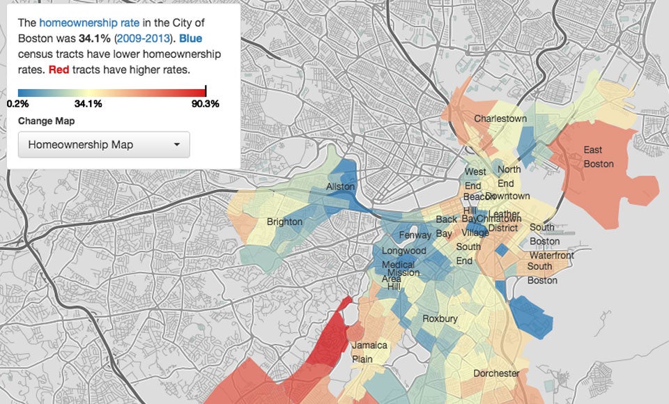
According to the United States Census Bureau, the homeownership rate in Boston is 34.1, but some neighborhoods have quite a higher percentage of owners than others.
DJ Hartman, who just graduated from Northeastern University with a degree in computer science and interactive media, made a map for his visualization technologies class where he looked at a neighborhood-by-neighborhood analysis of five metrics: unemployment, household income, rent burden, travel time to work, and homeownership rate.

“I wanted to map rent prices in Boston in a manner similar to real estate websites like Trulia and Zillow,’’ Hartman told Boston.com. “As I started to explore the census data, other things like rent-burdened households and income inequality became more interesting.’’
The map allows you choose what metric you want to look at and then scroll over different Boston neighborhoods to see the rate.

“The data is taken from the American Communities Survey 2010 five-year estimates and the 2010 decennial census, downloaded via the Census Bureau’s website,’’ Hartman said.
Areas in West Roxbury, Hyde Park, Jamaica Plain, Dorchester, East Boston, and parts of Back Bay, Charlestown, and South Boston all have high homeownership rates, while neighborhoods like Allston, Fenway, Longwood, Mission Hill, and Roxbury have mostly renters.
Hartman’s map also looked at household incomes, which seemed to correlate high household income with homeownership. Lower household incomes were associated with renters. The median household income in Boston was $53,601 between 2009 and 2013, according to the Census Bureau.
Rent burden was another metric Hartman included on the map, which measured median gross rent as a percentage of household income and according to the Census Bureau, households that spent more than 30 percent of their income on rent are considered rent-burdened. Some of the highest areas of rent burden correlate with the lowest areas of income. The highest areas of rent burden include Allston, Fenway, Longwood, Dorchester, Roxbury, and East Boston.

Other groups have recently made related maps regarding Boston’s rent increases over time and median rents per neighborhood.
You can see the interactive version of the map here.


To comment, please create a screen name in your profile
To comment, please verify your email address
Conversation
This discussion has ended. Please join elsewhere on Boston.com