What Boston neighborhood maps would look like if Roy Lichtenstein painted them
A cartography student created this colorful, interactive map, inspired by the pop artist from the 1960s.
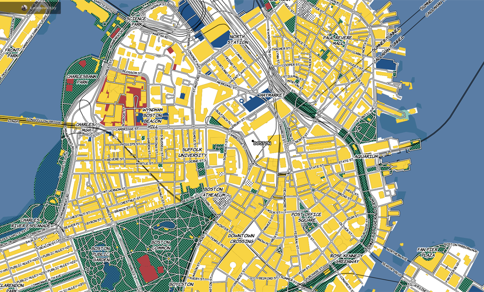
Even with the city finally in a spring bloom, Boston has never been this colorful before.
[fragment number=0]
The map, which was created by Katie Kowalsky, a cartography undergraduate at the University of Wisconsin-Madison, pops with the bold, primary colors used by the American artist Roy Lichtenstein.
It was a challenge to map the whole world in such a limited color scheme without “being hard on the eyes,’’ Kowalsky toldThe Atlantic’s CityLab.
[fragment number=1]
The vibrant yellow color of buildings on Kowalsky’s map draws attention to the architectural differences among Boston neighborhoods.
You can see the orderly, suburban layout of South Boston’s single-family lots.

Compare that to the large, but relatively sparse, structures just next door in the Seaport District, which is dominated by towers full of luxury condos and apartments.

You really get a sense for how densely packed the center of the city is, where pretty much everything but the Boston Common is solid yellow.

Just a few miles away in Brookline, things look different. Lots are comparatively enormous, and there’s much more green space.

It might explain why this neighborhood was the site of Brookline’s most expensive home sale so far in 2015, an $11.8 million deal that closed in February.
You can see more of Kowalsky’s cartography work on her website, and follow her on Twitter here.


To comment, please create a screen name in your profile
To comment, please verify your email address
Conversation
This discussion has ended. Please join elsewhere on Boston.com