‘Calamine’ or ‘Dead Salmon’: What’s behind paint names
If you’re shopping for pink, say, you’ll find dozens of shades referencing roses, bubblegum, and shells.
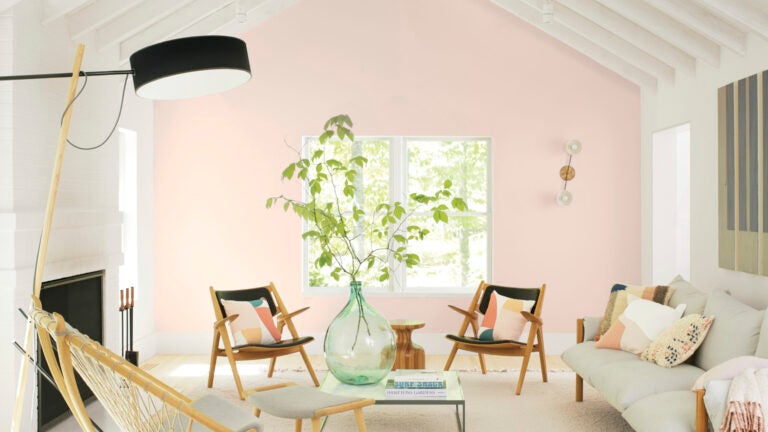
Ever wonder how paint colors get their names? If you’re shopping for pink, say, you’ll find dozens of shades referencing roses, bubblegum, and shells. There are some extra-evocative names like “Calamine’’ and “Dead Salmon.’’ And what about a pink called “Harajuku Morning?’’ “Modern Love?’’
Names can sway a person, New York designer Daun Curry said. “We once had a client choose one paint color over another because the name was ‘Peace and Happiness,’ ’’ she said.
More often, we pick a shade because we like it, said color consultant Debra Kling of New York, and “the names’ associations serve to augment our feelings about the hues.’’
She warns clients that paints when applied can look very different from their names: Creams, especially, easily veer into yellow territory, even when there’s no hint of that hue in their name.
Natalie Ebel, cofounder of the direct-to-consumer paint company Backdrop — which is behind “Harajuku Morning’’ and “Modern Love’’ — said choosing the right names for paint colors is essential.
“We encourage customers to not just paint their walls, but create their backdrop,’’ she said. “So each name was chosen to evoke an emotional connection; we were inspired by real people, places, things, and moods.’’
Farrow & Ball is known for creative naming; their latest Colour By Nature palette, made in collaboration with London’s Natural History Museum, was inspired by Werner’s Nomenclature of Colours, an 1814 guide that cross-references hues with markings and colorations found in nature. “Scotch Blue,’’ for example, suggests both the throat of a blue titmouse and copper ore.
Time and place also provide inspiration, said Farrow & Ball color consultant Joa Studholme.
“Occasionally, the paint name comes almost before the color. ‘Plummett’ was mixed after an afternoon spent fishing on the river, where the color of the lead used to weight the fisherman’s line was a thing of such beauty that it just begged to be added to the Farrow & Ball palette,’’ she says.
Studholme shares the backstories on two Farrow & Ball pinks, “Calamine’’ and “Dead Salmon’’:
“For many people of a certain age, Calamine lotion was an intrinsic part of early life. Applied to treat scraped knees, stings, and the general travails of a lively childhood, it was always of comfort. And what was more calming, the actual lotion or its extraordinary delicate color? It certainly creates soothing rooms in the modern world,’’ she said.
As for the fishy one, the name was found on a decorator’s invoice dated 1805 for a library. “Salmon is the color, and Dead actually refers to the matte paint finish,’’ Studholme said.
Another rosy paint that Studholme thinks is well-named was inspired by the soft, feminine shade found in traditional ladies’ private quarters. But “Boudoir Pink’’ didn’t sit right, she said. “So, we spent time considering how the boudoir got its name, only to discover it comes from the French “bouder,’’ meaning ‘to sulk.’ Thus, “Sulking Room Pink’’ was born.’’.
Pink has enjoyed a favored position in the color pantheon since at least 2014, when movie director Wes Anderson clad his “Grand Budapest Hotel’’ in the hue. That was followed by rose gold fever. Color company Pantone designated light pinks as signature colors in both 2016 and 2017.
Paint marketers generally like names that are aspirational, that stir the imagination. “First Light’’ is Benjamin Moore’s 2020 Color of the Year, a dreamy, soft shade of pink. The company’s director of color marketing and development, Andrea Magno, said that while the color was already part of Benjamin Moore’s 3,500-hue library, “it’s always fortuitous when the trend concept and color name complement one another. While descriptions like ‘light pink’ are quite straightforward, we also look for names that evoke positive associations and experiences.’’
PPG Paint’s senior color marketing manager, Dee Schlotter, said “Linen Ruffle’’ is the top pink requested on the company’s Paintzen platform. It’s a pale, taupe-tinged white with a pink undertone, named to evoke images of ruffly pillows and curtains.
And what about “Kenny’s Kiss’’ or “Salsa Diane,’’ two other pinks in the PPG collection? The former was named after an employee’s dog; the latter after a color lab stylist’s beachy dress.
HGTV Home by Sherwin-Williams’ color of the year is “Romance,’’ another gentle pink with a name that stirs feelings.
Ebel, of Backdrop, said pinks have been the most fun to name.
“I wanted to keep the colors and names approachable for people like me — I wasn’t a huge pink person before Backdrop,’’ she said.
“ ‘Harajuku Morning’ was inspired by a trip we took to Tokyo in 2016. The color is bright, airy, and fun, and reminded us of the playfulness of Takeshita Street, but in the morning before the crowds. “Modern Love’’ was inspired by one of my favorite New York Times columns — the color makes me think of the beautiful, messy feelings that come with relationships,’’ she said.
Just like the beautiful, messy relationship we all have with the brushes, rollers, and paint colors we bring home.
Subscribe to the Globe’s free real estate newsletter — our weekly digest on buying, selling, and design — at pages.email.bostonglobe.com/AddressSignUp. Follow us on Facebook, Instagram, and Twitter @globehomes.


To comment, please create a screen name in your profile
To comment, please verify your email address
Conversation
This discussion has ended. Please join elsewhere on Boston.com