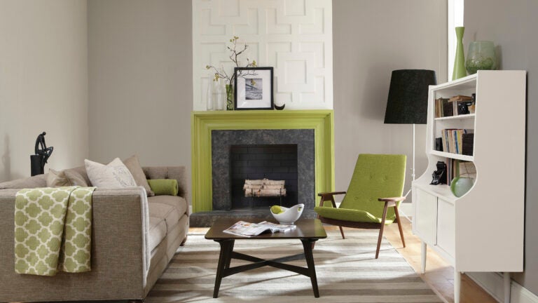
Gray is red-hot for interior paint. Even for trim.
Benjamin Moore carries more than 150 shades of gray, and Sherwin-Williams says that of their top 50 colors for interiors, 30 are grays.
Benjamin Moore carries more than 150 shades of gray, and Sherwin-Williams says that of their top 50 colors for interiors, 30 are grays.
‘‘The trend toward gray started in Scandinavia, became big in the United States around six years ago, and is still on the rise,’’ said Sue Wadden, director of color marketing at Sherwin-Williams.
Andrea Magno of Benjamin Moore said: ‘‘Gray is not going anywhere, and is still growing in popularity. It updates things instantly, and it’s evolving over time. And we’re seeing more gray cabinetry and more trim in gray now.’’

Just 15 years ago, she said, ‘‘if you told someone you were going to paint your room gray, they would groan and say, ‘How depressing.’ Before about 2010, it was all about warm Tuscan colors. Since then, it’s really about cool modern grays, and not just for paint colors. Stone, marble, tile, and wood have also gone a lot cooler.’’
But picking the correct shade of gray can be tricky.
‘‘It’s crucial to pay attention to the undertones and also how the light reacts to it,’’ Magno said. ‘‘Gray is a very sneaky color.’’
Grays have undertones of blue, purple, or green, and you’ll want to make sure the undertones are compatible with the surrounding tile, furnishings, and fabrics, designers say.
For a real ‘‘smack-in-the-middle gray,’’ Wadden suggests her company’s Repose Gray. ‘‘For walls surrounding pink tile in a bathroom, I’d go with Repose Gray, which goes great with pink and creates a neutral background,’’ she said.
Amazing Gray has a greener undertone, while Passive is cooler with more blue.
‘‘We typically try to steer clients away from purple undertones. Usually, we stick to true warms and true cools, and the middle ground, often referred to as French grays. They are pretty true grays,’’ said Cate Dunning, who, with Lathem Gordon, runs Atlanta-based GordonDunning Interior Design.

In addition to undertones, there’s a big difference between cool and warm grays, with the former better suited to modern interiors and the latter often better for traditional homes with warmer-colored furnishings, according to Dunning.
Too cool of a gray in extreme sunlight, like that in Florida, can sometimes look chalky, Wadden warns.
‘‘My best advice is to select your three favorite grays, paint a poster board with each one, and look at them in your home over a weekend, tallying up which one you like best at various times of the day and night. If you plunge in before doing that, you may regret it,’’ Dunning said.
‘‘You might love a picture you saw in a magazine, but it’s important to remember that the very same shade of gray might look entirely different in your own home,’’ Gordon said.
While undertones are hard to spot in a paint chip, they become more obvious on a larger surface like a poster board placed prominently in the room you are planning to paint, Magno added.
Some of Benjamin Moore’s more popular grays are Gray Owl, Balboa Mist, Coventry Gray, Stonington Gray, Revere Pewter, and Thunder, she said. Revere Pewter has a gray cast, ‘‘but it’s warm and very livable,’’ she said. ‘‘For cabinetry, it’s Kendall Charcoal.’’

What about trims? Although grays are generally used with lighter grays, whites, and off-whites, the latest trend is toward trim in the same or even a darker shade of gray.
‘‘We are loving doing everything in one shade of gray,’’ Gordon said. ‘‘It looks great, especially paired with light linen drapery with a little sheen to it. We are also seeing more interest in silvery grays.’’
Laurie Pressman, vice president of the Pantone Color Institute, also sees gray with gray trim as a trend.
‘‘White still feels safer to some people, but it’s easy to overlook how harsh white can feel. Give gray a chance,’’ Pressman said. ‘‘And if you’re nervous starting out, I’d recommend going with a shade with blue undertones.’’
Subscribe to the Globe’s free real estate newsletter at pages.email.bostonglobe.com/AddressSignUp.


To comment, please create a screen name in your profile
To comment, please verify your email address
Conversation
This discussion has ended. Please join elsewhere on Boston.com