MBTA unveils new system report card
The first week didn’t go so well.
How’d the trains run last week? It’s now a little easier to say. The MBTA on Monday launched a new performance metrics program that will give riders a weekly round-up of how well trains and buses across the system adhered to schedule.
Each week, a scorecard will be posted on the website of the T’s Fiscal and Management Control Board, according to MBTA Director of Operations Analysis Brian Kane. It replaces an old scorecard system that was taken offline about a year ago because of concerns about its measurements, Kane said.
The new weekly report breaks down of the percentage of buses and trains that arrived on time each day, both during peak and off-peak hours.
Success is measured differently depending on the mode of transportation. For example, for commuter rail trains, “on time’’ is defined as arriving within five minutes of scheduled arrival. For subway trains, which do not run on a set schedule but instead based on how recently the last train left the station, arriving within one minute of the expected window is considered passing.
If a subway line or bus route is on schedule 75 percent of the time on a given day, that’s considered a passing grade. The commuter rail is expected to hit 90 percent.
If riders were to take a look at the report for last week…

…they would see a lot of failing grades, especially on the Red and Orange lines, and on non-key bus routes. The Blue Line performed well enough to pass during rush hour last week, but struggled during the slower hours and over the weekend.
“There’s an awful lot of red up there, which means we were failing to hit our targets of 75 percent,’’ Kane told the control board. “I think we could all talk for a long time about why that’s the case, and I’m sure we will in the future.’’
The Green Line is not yet included, because its tracking technology is newer. It is expected to make its way into the report by the end of the year, according to Kane.
Performance on the commuter rail is also broken down to show each individual line.

This is an early version of a more interactive report that will eventually wind up on the T’s website, said Monica Tibbits-Nutt, a control board member who is leading a T working group focused on performance metrics.
“This is the beginning of a broader, more in-depth look at the key performance indicators,’’ she said. “What we are moving towards is transitioning to a dynamic, interactive, online report that will go a lot deeper than this does. People will be able to … really dig in [as] deep as you can go.’’
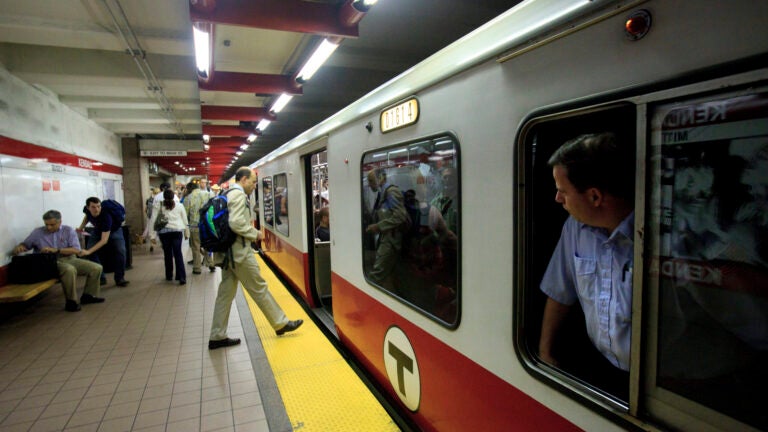
This is what the MBTA used to look like:
[bdc-gallery id=”56566″]


To comment, please create a screen name in your profile
To comment, please verify your email address
Conversation
This discussion has ended. Please join elsewhere on Boston.com