Newsletter Signup
Stay up to date on all the latest news from Boston.com
Spike, the Boston Marathon unicorn, is getting an upgrade — but some readers say it’s more of a downgrade.
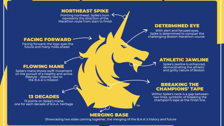
The Boston Athletic Association announced June 5 that the logo of the Boston Marathon was getting a redesign in honor of Global Running Day. The logo now features the unicorn facing forward, symbolizing the organization looking toward the future of running as well as the future of its philanthropic efforts.
The redesigned logo also includes the unicorn’s horn facing the direction of the famous marathon route, 13 spikes on its mane that represent each decade the BAA has been operating, and physical characteristics like an “athletic jawline” and “determined eye.”
When the redesign was announced, we asked readers to share their opinions on the new logo. More than half of the 293 readers who responded to our poll said they did not like the new design, while about one-third of readers said they were indifferent to it. Fourteen percent of readers liked the new logo.
Readers who said they don’t like the new design cite some of the new characteristics of the iconic unicorn as being against the values of the Boston Marathon.
“Please keep the old logo. While the unicorn in the new logo may signify strength and power, it looks like a loner — cold and not welcoming. Too masculine. Eliminating the base dots is also a mistake. The unicorn doesn’t seem to have a supported base,” said Weijun L. from Yorba Linda, California.
Those who said that they loved the new Marathon logo liked its new modernity, with Robert Y. calling it “upscale” and “refreshing.”
Below, find a sampling of reader responses pertaining to their likes and dislikes of the Boston Marathon logo redesign.
Some quotes have been lightly edited for length and clarity.
“I think it innovative and LOVE the meaning behind each change.”
— Mimi M., Quincy
“Looks very classic, a very well-done upgrade/rebrand, and very thoughtfully done.”
— Magee, Dorchester
“Spike has been a mystery for decades. As the founder of Team Red Cross running Boston Marathon and a member of the B.A.A., I have been asked about the logo ‘unicorn’ many times. There is no precise answer to why this was selected over a hundred years ago. An updated, forward-looking Spike is perfect to reflect an organization that values a healthy lifestyle, honors runners and can continue to evoke growing to support the communities.”
— Karen T., Boston
“I like that it is just an update, not a major change. But the update and reasons behind the design were thought about.”
— Jeff, Boston
“Keeps to tradition but offers thoughtful updates and design elements. Well done!”
— Bob, Dover
“The world is full of change, nothing lasts forever. Time to update the old Boston Marathon logo and go for a new, modern one.”
— Jerry and Zellah S., Phoenix, OR
“The unicorn itself looks fine to be honest. Don’t have any real negative views of it. It’s that the full logo has dropped the BAA entirely and now has the Bank of America logo on it is what I find distasteful. How much longer till Bank of America just drops the unicorn entirely and replaces it with their logo and it’s renamed the ‘Bank of America Marathon in Boston’ or something? It’s really gross, John Hancock would never do this.”
— Benjamin, Somerville
“It’s just a logo. Period.”
— Jay Z., Plano, TX
“I like the more ‘active’ look overall, but think it’s kind of choppy-looking —not very sleek. It’s almost like the BAA required the designer to accommodate the eight ‘statement points’ somehow to sell the concept to the BAA. I don’t like the idea of providing advertising space as part of the design. The Boston Marathon is not just another marathon and its logo should stand on its on and not serve as an advertising item.”
— Jack S., Mashpee
“I liked the old and I like the new. Don’t think I have another Boston in me, so my old mementos will have to do.”
— Manny, Virginia
“I guess I’m genuinely ambivalent. This just strikes me as something designed by a focus group to appear edgy and relevant. Why does everything need to imbue meaning now? Why can’t something just ‘be’?”
— Mike P., Chicago
“I’m not sure the redesign was really necessary.”
— John G., Kearns, UT
“The old logo is cleaner, simpler snd smoother looking. The new one is jagged and with lots of sharp and pointy shapes. Apart from the aesthetics, assigning each pointy shape a lofty message or value strikes me as marketing gone amuck. Can’t imagine anyone seeing it and saying, ‘Look at that athletic jawline. That coveys to me how athletic and gritty Boston is.'”
— Susan L., formerly MA
“It appears overly complicated and pretentious, losing the simplicity and resilience that the marathon should embody. The new logo fails to convey the event’s history and tradition effectively.”
— Wendy
“This is a boring, unimaginative and unnecessary revision. Changes must be additive — this doesn’t add anything in the place of what it’s losing. The old logo has history and nostalgia on its side. This tweaked version loses that … and for what? The explanations behind the artistic decisions here are weak, too.”
— Noah T., Somerville
“Tradition, tradition, tradition … that is what the Boston Marathon is about! If it ain’t broke, don’t fix it.”
— Gary Y., Endicott, NY
“I believe in tradition. Why does the logo have to change for the sake of change? People are not going to look at the new logo and understand or remember the reason behind the changes that have to be explained to us.
— Nancy, Braintree
I think instead it will promote a negative feeling of loss of what was a clearly recognized symbol. Sad.”
“The original is a classic, why mess with it? I don’t like all the jagged lines and hard edges. Who cares what they represent if it’s not obvious to the viewer Big thumbs down.”
— Dan O., New York City
“Why fix a logo that has nothing wrong with it? It was a logo of heritage and now we start over.”
— Ting, Wellesley
Stay up to date on all the latest news from Boston.com


To comment, please create a screen name in your profile
To comment, please verify your email address
Conversation
This discussion has ended. Please join elsewhere on Boston.com